A TORONTO BEACHES REMODEL: A COZY BLEND OF OLD AND NEW (PART 1)
- Amanda Shields
- Apr 2, 2024
- 3 min read
Updated: Apr 3

Today, I'm super excited to walk you through one of our latest adventures—the Kingswood Project. Tucked away in the charming Toronto Beaches area, this old Victorian beauty was screaming for a makeover. And not just any makeover, but one that mixes its historic charm with the cozy, lived-in vibe we all crave. This is just the start of our journey, with a spotlight on the kitchen and family room's transformation. So, grab your favorite cup of coffee, and let's dive in!
The Before
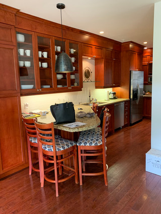
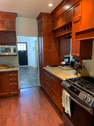
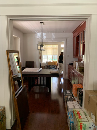
Imagine stepping into a house and the first thing you see? A galley kitchen straight out of the 80s or 90s, complete with floor-to-ceiling red mahogany cabinets. The layout's all over the place, with a tiny living area that's trying too hard, plus dining and formal living rooms doing their own thing. High ceilings and loads of windows hint at what could be, but the overall feel? It's crying out for a makeover.

The Wishlist
Our lovely clients came to us with dreams of a space where modern meets traditional, without losing the soul of their Victorian gem. They imagined a luxe, custom kitchen that opens up into a living area that's all about family time, minus the old-school formal living room. Think warm woods, an island that's a hub for everything, and a living room that's all about kicking back and soaking in the light from those gorgeous windows.
The Process
When we first started sketching out ideas, everything was on the table, even adding more space. But here's the thing—our clients chose to pour their hearts (and budget) into creating a space that feels like home, with killer finishes that tell their story, rather than going big on size but skimping on the charm. With our go-to crew at Galle Construction and their genius architects, we mapped out a plan that made every inch count, picking out the perfect touches that bring the whole vision to life.
The After
Welcome to the heart of the home! We transformed the old galley kitchen into a U-shaped masterpiece centered around an island that's all about bringing people together. The cabinets are painted creamy white from Benjamin Moore, set against a backdrop of dark mahogany wood that adds just the right amount of warmth. The showstopper? A stunning plaster-clad hood range that's all about that organic feel, matched with porcelain countertops and backsplashes that captivate. And those brushed gold details? Chef's kiss!

We gave the living room a total makeover, moving the fireplace for a better flow and feel. The new focal point is a custom stone mantel that's pure elegance. The lower cabinets are painted in a Soot by Benjamin Moore, grounding the space with a sense of sophistication. Above, open wood shelves and closed cabinets in a walnut-stained oak offer the perfect mix of display and storage. And the cherry on top? Black framed glass doors on the open shelves, adding a modern twist that ties everything together beautifully. We didn't stop there—we added a large sectional sofa, giving our clients ample space to entertain or lounge, truly making it the heart of this Toronto Beaches remodel.


The Kingswood Project is close to our hearts because it's all about blending the past with the present in a way that feels authentic and warm. We're peeling back the layers of this transformation one space at a time, so stay tuned for more behind-the-scenes peeks in part 2 where we uncover the dining room, the foyer and much more.
At Amanda Shields Interiors, we're not just designing spaces; we're crafting homes that tell your story, filled with moments that matter. Thanks for joining me on this journey, and here's to creating more spaces that feel like home, sweet home.
All Professional Photography by @mike_chajecki


Comments